Sales & Customer Analytics Dashboards
🧩 The Challenge
Estrada's leadership team needed a comprehensive, interactive analytics solution to monitor sales performance and customer behavior across multiple dimensions.
The goal was to empower decision-makers with real-time insights into year-over-year trends, product performance, and customer engagement—without requiring them to dig through raw data.
🎯 The Solution
I designed and developed two dynamic Tableau dashboards — one focused on Sales Performance and the other on Customer Insights, tailored to the needs of both strategic and operational stakeholders.
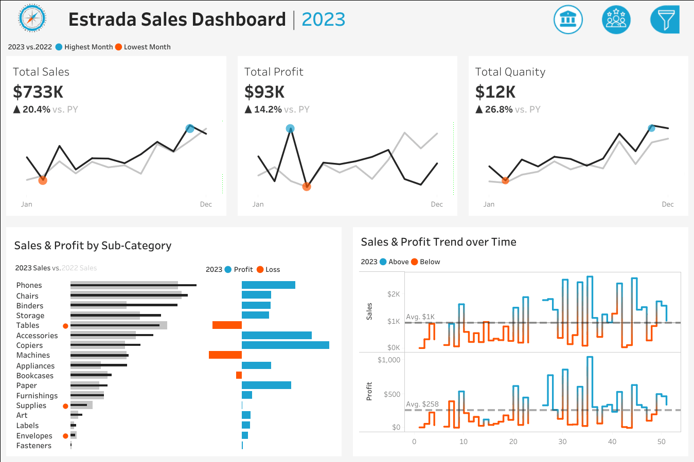
📈 Sales Dashboard Highlights
- KPI Overview: Delivered a clean summary of total sales, profit, and quantity sold for both the current and previous year.
- Sales Trends: Visualized monthly performance with clear indicators for peak and low-performing months.
- Product Subcategory Comparison: Enabled side-by-side analysis of sales and profit across product subcategories to identify top and underperforming segments.
- Weekly Trends: Introduced a weekly breakdown of sales and profit with average benchmarks, highlighting anomalies to support tactical decision-making.
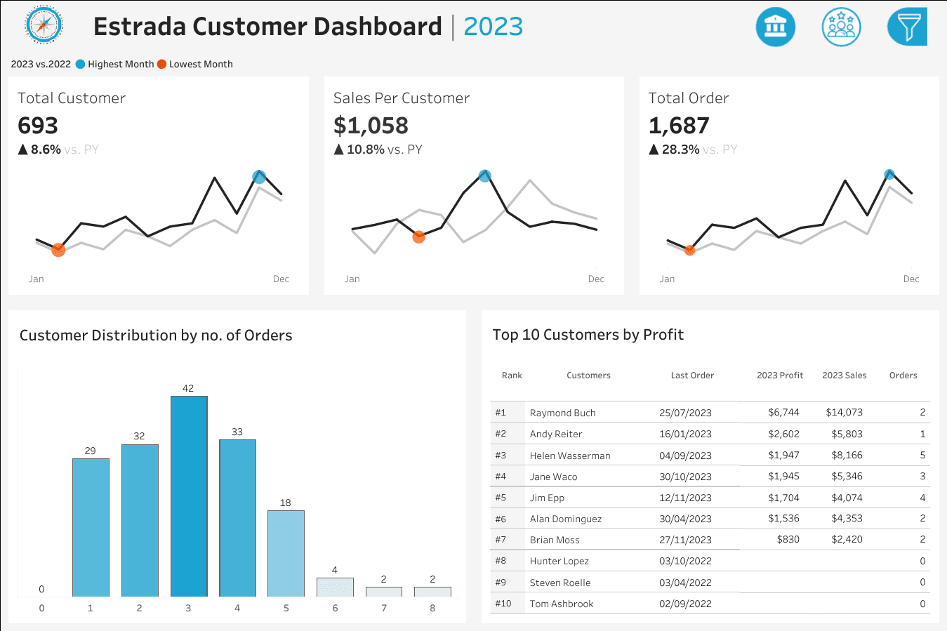
👥 Customer Dashboard Highlights
- KPI Overview: Showcased total customers, average sales per customer, and order volume across two years.
- Customer Trends: Illustrated monthly customer behavior patterns, emphasizing seasonal highs and lows.
- Order Distribution: Built a histogram to segment customers by order frequency, revealing loyalty and engagement levels.
- Top 10 Customers: Ranked high-value customers by profit, enriched with order count, sales, and last purchase date for targeted retention strategies.
🧠 Design & Interactivity Features
- Year Selector: Users can toggle between years to analyze historical performance.
- Cross-Dashboard Navigation: Seamless transitions between sales and customer views.
- Interactive Filters: Enabled drill-down by product category, subcategory, region, state, and city.
- Clickable Visuals: Empowered users to filter data directly from charts for intuitive exploration.
💡 Impact
These dashboards transformed how Estrada's teams interact with their data — shifting from static reports to self-service analytics.
Executives now make faster, data-driven decisions, while marketing and sales teams can proactively identify trends and opportunities.
The implementation resulted in:
- Reduced reporting time by 70%
- Increased data accessibility across all departments
- Improved decision-making speed by providing instant insights
- Enhanced collaboration between sales, marketing, and executive teams
🛠 Tools & Technologies
Primary Tool: Tableau Desktop & Tableau Server
Key Techniques:
- Advanced calculated fields for YoY comparisons
- Custom parameters for dynamic filtering
- LOD expressions for complex aggregations
- Dashboard actions for interactive cross-filtering
- Custom color palettes for brand consistency
📊 Technical Approach
The dashboards were built with a focus on:
- Data Modeling: Structured data relationships to enable flexible analysis
- Performance Optimization: Efficient calculations and extract refresh schedules
- User Experience: Intuitive navigation and self-explanatory visualizations
- Mobile Responsiveness: Layouts optimized for viewing on various devices
- Scalability: Architecture supporting future data growth and additional metrics